Lightroom

Piney Point Lighthouse (Black & White) by Todd Henson

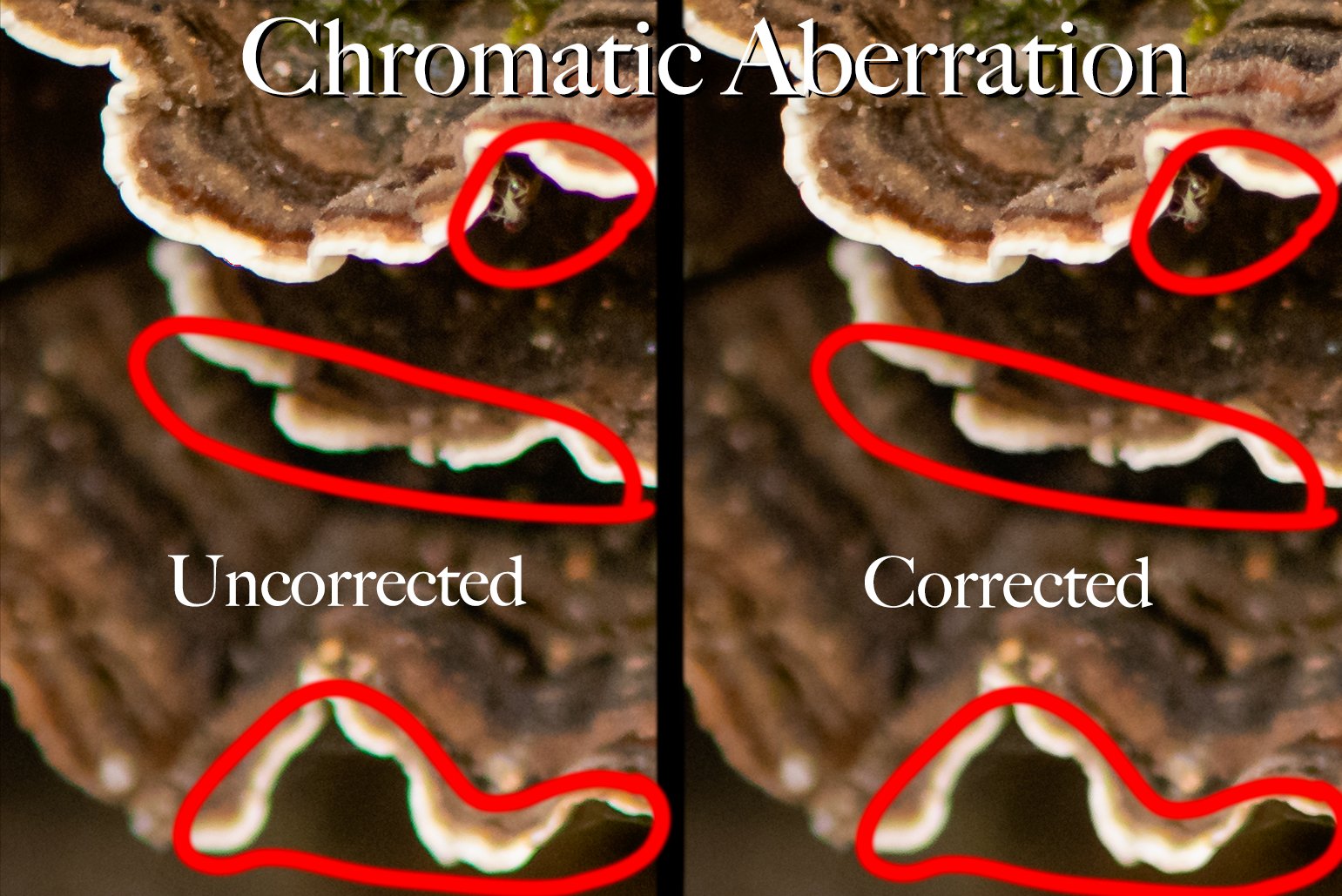
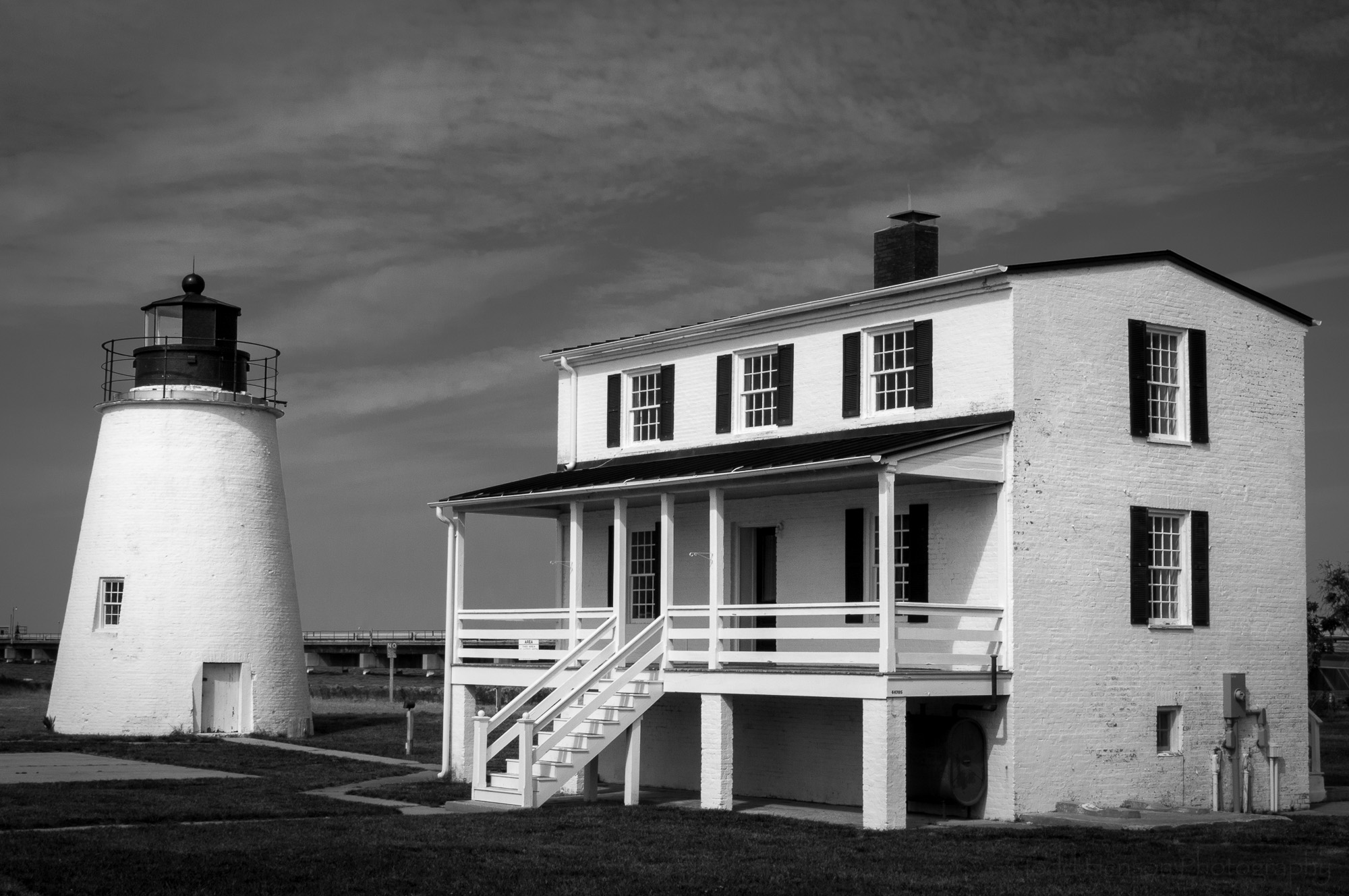
Black and white image of Piney Point Lighthouse in St. Mary's County, Maryland

Converting a photograph from color to black and white can sometimes bring new life to an otherwise ordinary image, as seen in this image of the Piney Point Lighthouse in Maryland. And some images just seem better suited to black and white. In the days of film you chose either color or black and white film and from there your decision was fixed. Shooting in digital gives much more flexibility.

The camera captures all the color information. You can then choose to either keep the image in color or convert it to black and white. And with the software we have today we’re able to use all the color information available to map colors in the color image to tones in the black and white image.

We don’t just drop the color and turn it greyscale. Software such as Adobe Lightroom makes this process very easy. This particular image of Piney Point Lighthouse in Maryland was processed completely in Lightroom. If you want more powerful options you can use Adobe Photoshop, perhaps taking advantage of layers and channels. Various plug-ins for Lightroom and Photoshop, such as Silver Efex Pro from the Nik Collection and ON1’s Perfect B&W, provide many presets and increase the ease of use. The digital workflow for black and white is very flexible, and you can keep it as simple as you’d like, or experiment with an almost endless array of options.

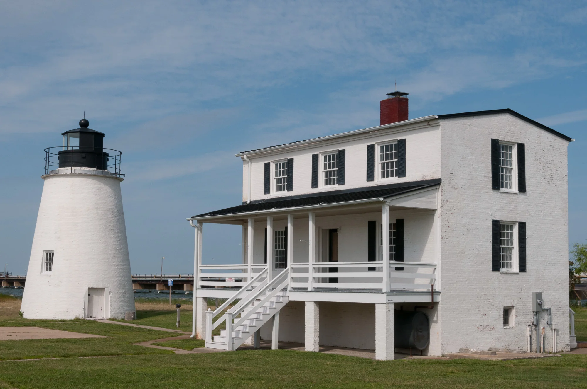
Color image of Piney Point Lighthouse in St. Mary's County, Maryland

The color version of this image is ok. It’s a decent documentary photograph, but it’s nothing special and the color doesn’t contribute much to the image. So I converted it to black and white to see what I could make of it.

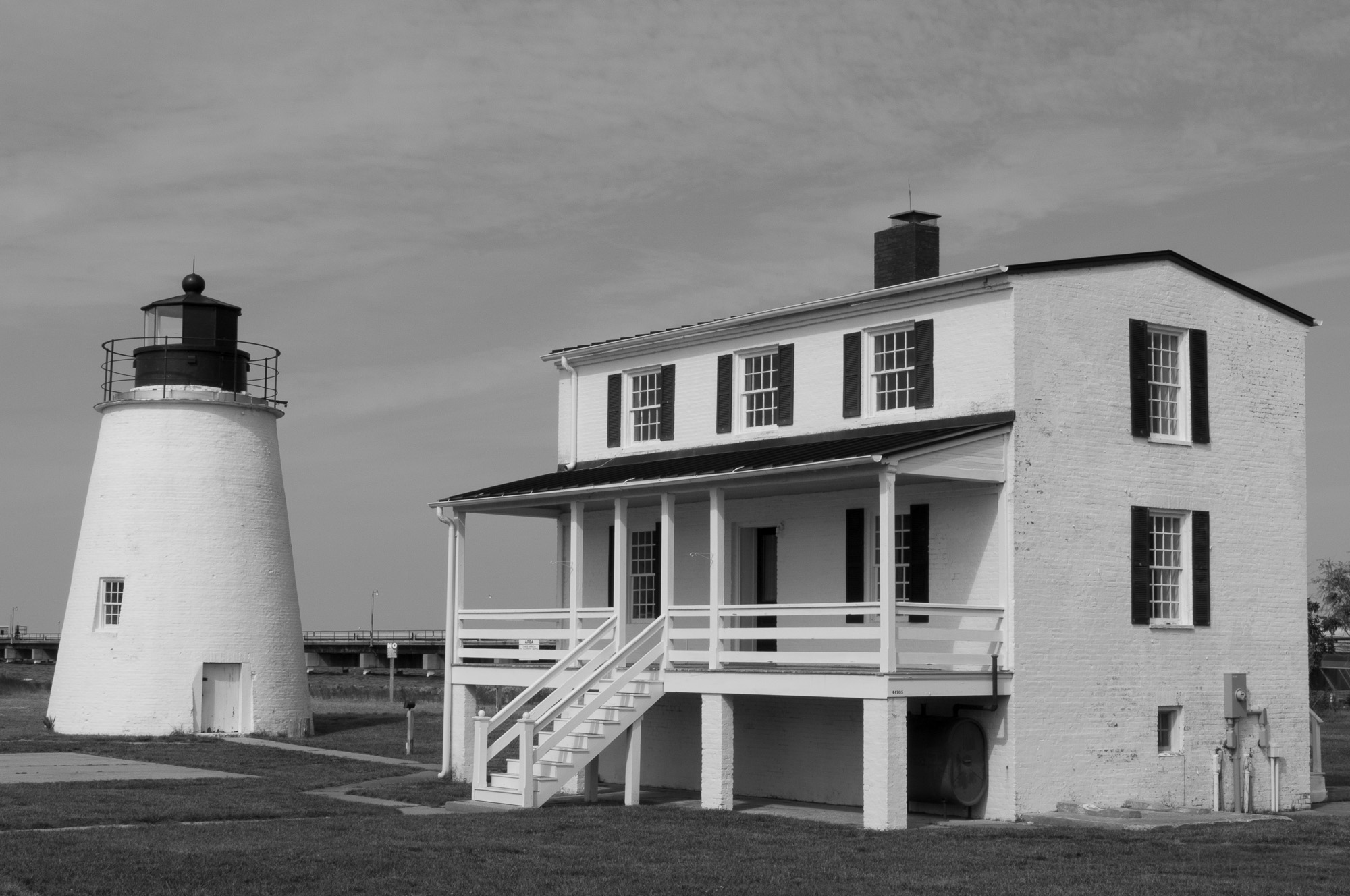
Lightroom settings: Initial conversion before any tweaking.

Once it was in black and white I did many of my usual adjustments, tweaking whites and blacks, highlights and shadows, and various other global adjustments. The power of the black and white conversion is in the mapping of colors to tones. In Lightroom this is done with the Black & White Mix panel. This is where we can tweak 8 color channels (red, orange, yellow, green, aqua, blue, purple, and magenta), adjusting each of their tones, making them lighter or darker. This lets us choose what we’ll set to white, to black, and to the various levels of grey. We can adjust each slider, or we can click the little circle in the upper left corner of the panel, then click on an area of the image. This selects that color and lets us slide the mouse up and down to adjust the tonal mix of that color. This is a great way to quickly tweak all the tonal ranges.

Lightroom settings: Final conversion.

I selected the blue in the sky and darkened it, while selecting the clouds and keeping them a little lighter. This helped bring out a little texture in the sky, something I felt was missing in the color image. I darkened the green of the grass. I kept the whites of the house and lighthouse white, and darkened the trim, which was already black in the color image. I made a number of other minor adjustments, adding a vignette, applying lens corrections to keep straight lines as straight as I could, and applying various local adjustments. I also removed a light post from the bridge that bothered me. If this image were intended to be journalistic I would not have removed anything.

Click on the image or thumbnails below to see the color image, the initial black and white conversion, and the final black and white conversion:

Overall, I’m pleased with the results. I love black and white images, and I’m beginning to explore the conversion process in some of my older images. Next comes the process of learning to pre-visualize images in black and white when I snap the shutter, knowing I will later convert it to black and white. I have to think being intentional about the process can only lead to better images.

If you’re interested in the lighthouse, itself, it is located at Piney Point in St. Mary’s County, Maryland. And be sure to stop by the Piney Point Lighthouse Museum, as well.


Do you enjoy these posts?

Sign up to receive periodic emails with updates and thoughts. Don’t worry, I won’t spam you. And please consider purchasing artwork or products from my online store, and using my affiliate links in the sidebar to the right when shopping online.

I appreciate your support!


White Water Lily - The Story Behind the Image by Todd Henson

White Water Lily - the final image

This white water lily image is my favorite photograph from a trip to Kenilworth Aquatic Gardens last year. There was light rain in the morning that covered all the flowers with rain drops, and the clouds acted as perfect soft boxes, providing beautiful soft light for white flowers. If it had been fully sunny there would have been far more contrast and far more risk of blowing out highlights and losing detail in the white petals. I felt the lighting was perfect for the subjects.

White Water Lily with ripples in pond

I walked around the ponds containing white water lilies, wanting to capture some images while the light was good. I tried a few shots while rain was falling, as seen above. I liked the ripples in the pond created by the rain. It added some nice patterns, and I thought the flower stood out well against the ripples. But I didn’t care as much for the composition. This particular water lily wasn’t appealing to me and I didn’t like the placement of the lily pads. So I kept walking around the ponds looking for other subjects.

White Water Lily surrounded by lily pads

The next water lily I found was growing at water level. I liked this. I liked how the lowest petals pushed against the water and created some texture. I liked the low angle, but would have liked a better view of the yellow center of the flower. And I was slightly distracted by the lily pad in the front, where a curl of the green overlapped one of the flower petals.

Less distracting White Water Lily, but still lacking something

I found another water lily raised above the water, like the first. I focused in more on the flower, with less distraction in the background. There were some lily pads in the background under the water, but these weren’t overly distracting, and I could lessen the distraction in post-processing. But the shape of the water lily wasn’t working for me. Nor was my placement of the flower dead center in the frame. Thankfully, there were many water lilies in the pond and lots of opportunities for creating different compositions. I moved on to the next one.

White Water Lily, getting closer to a composition I like

Now I was getting somewhere. I had a water lily growing at the surface of the water, with the bottom petals pushing against the water. I had a nice view of the yellow center of the flower. I had what I felt was a beautiful looking water lily. Unfortunately, my framing was off. The flower was dead center, which isn’t always bad, but didn’t seem to work in this case. And there was a distracting, unattractive bit of lily pad on the top right. But I had found the flower I wanted to photograph, I just needed a better composition, a better position to shoot from. So I repositioned myself and kept shooting.

White Water Lily. This is the composition I was looking for.

Now we get to the final composition, the one I was most pleased with. I’d repositioned myself such that I could eliminate any distracting lily pads, but was still able to view some of the nice yellow detail at the center of the flower. The light was great, the flower almost glowed. I checked the image on the camera LCD, then looked at the histogram to be sure I hadn’t blown out any highlights. Nothing was blown out, and no shadows were blocked up, so I’d captured all the detail I could. I make great use of the histogram in judging exposure. One glance and I know if I’m blowing highlights or blocking up shadows, neither of which is necessarily bad, but I want to be intentional in what I’m doing. I’m ok blowing highlights if I know I’m doing it, such as when photographing into the sun or at a shiny silver metallic surface. But in this case I did not want to lose any detail.

White Water Lily, the final edited photo.

When I got home I imported the photos into Lightroom and began the editing process. I don’t usually do a lot of post-processing. In this case the edits consisted mostly of tweaking exposure, highlights, and shadows, and cleaning up some of the distracting elements in the water. I lowered the exposure of the water, darkening it, to help draw attention to the flower. I made sure the flower was nice and white, not a dull grey. I also brought out details in the flower, especially the yellow center. I wanted the center to glow, just as it had when I saw it.

Looking back, I wish I’d tried some shots with greater depth of field (higher f-stop number). I would have liked to see more detail in the back petals. But I’m still very happy with the results. Below is a comparison of before and after. I hope you enjoy, and I hope this helps you in thinking, or feeling, your way through future shots. Keep your eyes open, look for distracting elements, be aware of composition, be aware of how the scene makes you feel. As David duChemin often writes about, shoot with intention, with purpose, with vision. 

Below are the before and after images:


Do you enjoy these posts?

Sign up to receive periodic emails with updates and thoughts. Don’t worry, I won’t spam you. And please consider purchasing artwork or products from my online store, and using my affiliate links in the sidebar to the right when shopping online.

I appreciate your support!